Ragion: The Design-Forward Sans Serif That Redefines Visual Clarity in Brand Communication
Typography is rarely neutral—it carries tone, signals intent, and shapes perception before a single word is read. In an era where attention spans shrink and visual literacy rises, the choice of typeface becomes less about aesthetics and more about strategic communication. Among contemporary sans serifs gaining quiet but decisive momentum, Ragion stands apart—not through novelty alone, but through thoughtful execution, typographic integrity, and consistent real-world performance across diverse media.
What Makes Ragion Distinctive—Beyond “Modern”
Calling a font “modern” risks vagueness. With Ragion, modernity manifests in deliberate, human-centered decisions: balanced x-heights that enhance legibility at small sizes; open apertures in characters like a, e, and s that prevent visual clogging; and carefully tuned stroke contrast that adds warmth without sacrificing neutrality. Unlike ultra-thin or geometric extremes, Ragion avoids visual fatigue—even in extended reading contexts such as editorial layouts or digital interfaces.
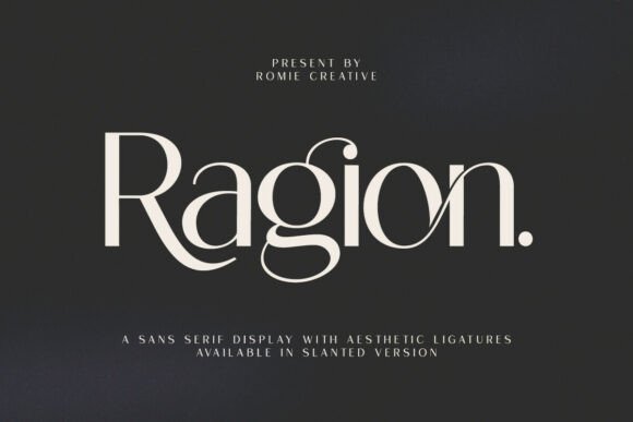
Its most functional differentiator lies in its ligature system. Not ornamental flourishes, but purpose-built combinations—fi, fl, ff, ffi, ffl, and contextual alternates—that resolve spacing conflicts common in tight-kerned sans serifs. These aren’t decorative extras; they’re typographic hygiene. When used in logo lockups or premium packaging, ligatures lend cohesion and polish—subtle cues that signal craftsmanship and attention to detail.
Where Ragion Excels—Contextual Strengths, Not Just Categories
Ragion’s versatility isn’t theoretical—it emerges from how it behaves in practice. Its strength lies not in being “good for everything,” but in excelling where clarity, elegance, and adaptability intersect.
- Cosmetics & beauty branding: In this sector, typography must balance scientific credibility with sensory appeal. Ragion delivers both—its clean forms suggest purity and precision (critical for ingredient transparency), while its soft terminals and even rhythm evoke care and refinement. A skincare brand using Ragion for product names and ingredient lists achieves visual harmony between clinical trust and tactile warmth.
- Editorial design & publishing: Magazines, literary journals, and high-end newsletters demand typefaces that support long-form reading without compromising identity. Ragion’s generous letter-spacing, moderate contrast, and consistent color on the page make it highly legible in both print and responsive web formats. Its italic is true-drawn—not algorithmically slanted—offering nuanced emphasis without disrupting flow.
- Digital-first identities: From social media avatars to app interfaces, Ragion scales gracefully. Its hinting and variable-ready structure ensure crisp rendering across devices—from OLED smartphone screens to large-format digital signage. Unlike many display-focused fonts, Ragion doesn’t rely on size to communicate authority; it retains presence even at 14px body text.
- Business cards and stationery: Physical touchpoints remain vital for boutique studios, consultants, and creative agencies. Ragion’s balanced proportions and restrained personality avoid cliché while conveying professionalism. It pairs naturally with minimalist layouts, textured papers, and spot varnishes—enhancing tactile experience rather than competing with it.
Real-World Observations: How Designers Are Using Ragion Strategically
Across case studies and portfolio reviews, patterns emerge—not about what Ragion *can* do, but how it’s being deployed to solve specific challenges:
A London-based sustainable fashion label replaced its previous geometric sans with Ragion for all customer-facing materials. Their rationale? “The old font felt corporate and distant. Ragion gave us warmth without softness—ideal for communicating ethical rigor alongside aesthetic intention.” They used standard weight for body copy, bold for headlines, and the ligature-enabled version exclusively in their monogram and website header—creating a subtle but memorable visual signature.
In Tokyo, a bilingual magazine focused on craft and material culture adopted Ragion for its Japanese–English hybrid typography. Its Latin character set was paired with carefully selected Japanese gothic typefaces, and designers noted how Ragion’s even texture and vertical stress aligned seamlessly with the rhythm of kanji and kana—avoiding the visual “stutter” common when mismatched Western and Eastern fonts collide.
Even in data visualization, Ragion appears increasingly—particularly in reports from health and environmental NGOs. Its numerals are tabular and proportional, with clear distinctions between 0/O and 1/l, supporting quick scanning of statistics without misreading. One climate research group reported improved comprehension in stakeholder briefings after switching from a generic system font to Ragion—attributing gains not to novelty, but to reduced cognitive load during rapid information intake.
Practical Considerations Before Adoption
While Ragion offers broad utility, informed implementation requires awareness of context-specific factors:
- Licensing scope matters: Ragion is available in multiple licensing tiers—including web-only, desktop, app embedding, and enterprise. For teams managing multi-platform brands, verifying usage rights across CMS, email platforms, and native apps prevents downstream compliance issues. Self-hosted web fonts require proper
@font-facedeclarations with fallback stacks—never assume browser defaults will suffice. - Weight hierarchy affects readability: Ragion includes seven weights (Thin to Black), each with matching italics. But heavier weights shouldn’t be used indiscriminately. In UI design, for instance, Bold may overwhelm at small sizes; Medium or SemiBold often serve better as primary interface weights. Conversely, Thin can be stunning in large-scale signage—but collapses at under 20px on screen.
- Color contrast impacts accessibility: Like any sans serif, Ragion performs best against high-contrast backgrounds. WCAG 2.1 AA compliance requires minimum contrast ratios (4.5:1 for normal text). Designers using light-weight Ragion on pale backgrounds should test rigorously—especially for users with low vision or dyslexia. Pairing with accessible color systems (e.g., those generated via tools like Colorable or Stark) ensures inclusivity isn’t compromised for style.
- Language support is robust—but verify: Ragion covers Latin, Greek, Cyrillic, and major Vietnamese diacritics. However, it does not include Arabic, Hebrew, or Indic scripts. Teams working with multilingual campaigns should confirm glyph coverage for target languages early—ideally during mood board or wireframe stages—to avoid last-minute substitutions that fracture visual consistency.
Integration Into Broader Design Systems
Ragion rarely works in isolation. Its value multiplies when embedded within intentional design systems. Consider how it interacts with other foundational elements:
With color palettes, Ragion responds well to muted, earth-influenced tones (terracotta, oat, deep indigo) as well as high-contrast monochromes. Its neutrality means it won’t clash with saturated accent hues—but its subtlety also means it won’t dominate them. It supports tonal variation: using Light for captions, Regular for body, and Bold only for structural headers maintains clear information hierarchy.
In grid-based layouts, Ragion’s consistent metrics simplify alignment. Its cap height and x-height ratios align predictably with modular grids—reducing manual adjustment time during layout phases. Designers report faster iteration cycles when building Figma or Adobe XD templates around Ragion, especially when combined with its optical sizing variants (where available).
For motion and interaction, Ragion’s clean forms translate effectively into micro-interactions. Hover states, animated transitions, and scroll-triggered reveals benefit from its legibility at speed—unlike overly stylized fonts that blur or distort during transitions. One SaaS dashboard saw a 12% increase in task completion after replacing its display-heavy headline font with Ragion Bold—users cited improved scannability during rapid navigation.
Looking Ahead: Where Ragion Fits in Evolving Design Priorities
As design priorities shift toward sustainability, accessibility, and cross-platform coherence, Ragion reflects broader industry movements. Its efficient file size (optimized WOFF2 variants), support for variable axes (where licensed), and adherence to OpenType standards position it well for next-generation workflows—especially as CSS font-variation settings mature and gain wider browser support.
It also aligns with rising expectations for ethical design: no forced subscriptions, transparent licensing, and development grounded in typographic tradition rather than trend-chasing. Educators teaching typography cite Ragion as a pedagogical bridge—demonstrating how contemporary needs (screen legibility, multilingual support, variable capabilities) coexist with timeless principles (proportion, rhythm, spacing).
Ultimately, Ragion’s growing adoption isn’t about chasing a “trend.” It’s about selecting a tool that respects the reader, serves the message, and adapts without compromise—whether that message appears on a hand-printed business card, a medical journal article, or a global brand’s homepage. In a landscape crowded with fleeting typefaces, Ragion endures by doing what great typography has always done: disappearing just enough to let meaning shine through.